Adding content into Engage's creative design interface is as easy as dragging-and-dropping a placeholder from the options pane then customizing the content within. This allows you to insert your own text and images, link to your social media, and more.
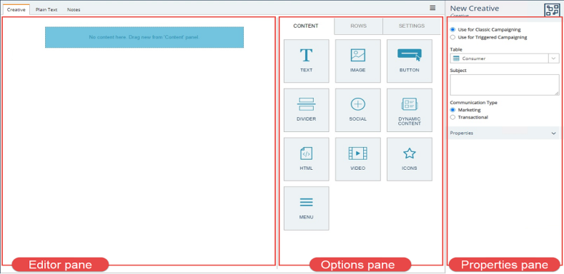
Content and styling options
-
Text - add a text box to hold the text of your email.
-
Image - add an image block to host a graphic or photo.
-
Button - add a call-to-action button.
-
Divider - add a divider to separate your content into sections.
-
Social - add social media links to your creative.
-
Dynamic content - adds a dynamic content block where you can assign mapped data, e.g. display gold tier promotional offers for gold tier customers.
-
HTML - adds a block where you can insert your own HTML.
-
Video - inserts a video block to embed a video hosted on YouTube or Vimeo.
-
Icons - adds a specialized image block that allows you to add a row of icons to your email, e.g. brand logos.
-
Menu - adds a block that allows you to construct a menu with hyperlinks, e.g. links to different product pages of your website.
-
Rows - Divide the rows of your email creative into columns.
Text boxes
To add a text box, drag-and drop the Text block from the Content tab onto the editor pane.
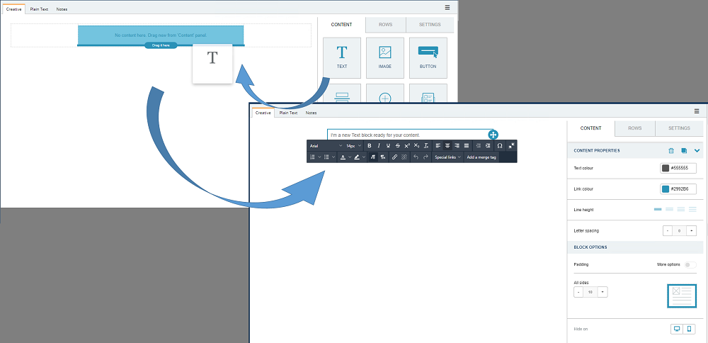
Clicking within the text box opens a formatting menu with common settings for formatting your text, e.g. alignment, text color, font, and font size.
If using a custom font, it will appear in the font dropdown list.
Images
Drag and drop the image block into your creative and use the Browse button to locate and upload an image.
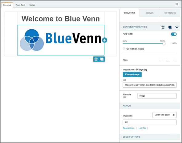
With the image in place, use the panel on the right-hand side to define the properties of the image.
-
Width - select to display the image with an auto width, as a percentage, and enable full width display on mobile devices. You can also choose if the image is aligned to the left, or right.
-
Image URL - change the image.
-
Alternate text - add a text description of the image for accessibility, i.e. use with screen readers.
-
Image link - define a destination URL a recipient will be taken to when they click the image. You can also specify an alternative action, like sending an email.
-
Block options - adjust the image padding.
Call-to-action
Call-to-action buttons can be added by dragging the option into a free region on the template.
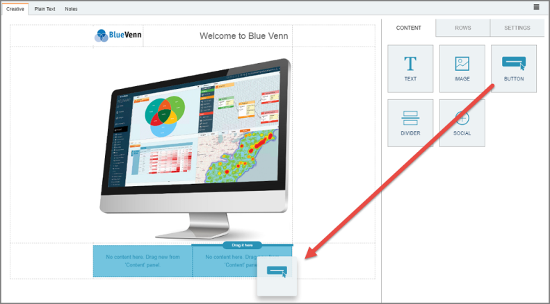
With the button in place, you can then make further design decisions using the right hand panel. You can define the link URL as well as various other cosmetic choices, like background and text color, alignment, borders, and padding.
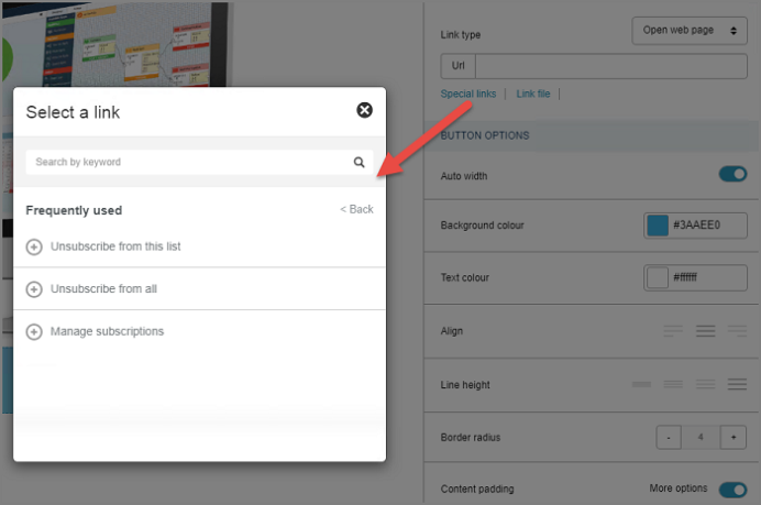
The Link Type drop down menu, as per the image link, can be defined to point to an email, call or SMS. Use Special Links to include any previously created links or include unsubscribe links and subscription management links. (Special Links require additional background configuration.)
Dividers
Handy dividers can be added using the drag-and-drop method and adjusted within the properties panel. You can adjust the line style, width, thickness, alignment, padding and color.
Social Media Functions
Dragging-and-dropping the social content block presents you with a standardized panel of social media icons. You can use the drop-down menu to choose from a selection of colors and styles. Each style option includes the same choice of four social media organizations – Facebook, Twitter, Instagram and LinkedIn.
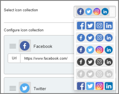
To remove an icon, click the Delete button found in the Configure Icon section found in the right hand panel.
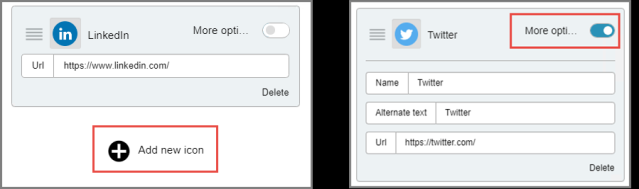
Alternatively, if you want to add a social media network, click the add button found at the bottom of the configure icon section. You can also customize the various social media options by clicking the more options slider. Here you can change the name, set alternative text and alter the URL.
Dynamic content
Adding dynamic content to a creative allows you to extend the personalization of your customer communications by including HTML components mapped to customer criteria, creating conditional displays, and applying dynamic content mapping.
HTML
If you are proficient in HTML, you can use the HTML block to insert HTML content. Use the box within the content properties to type your content.
Note: Make sure to use correct and responsive HTML or your message may not render properly.
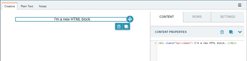
If your HTML is tailored for mobile content, you can also choose to have the HTML not display on desktop and vice versa.
Video
Dragging-and-dropping a video block into your HTML allows you to link to a video hosted on YouTube or Vimeo.
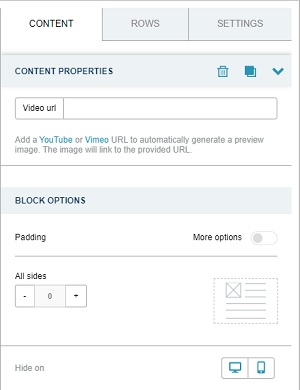
You can also specify the video padding. By default, padding is applied to all sides. Clicking the slider for more options allows you to tailor the padding for each side of the video. You can also choose to hide the video on mobile or desktop if required.
Icons
The icons block allows you to add a row of icons to your email, e.g. brand logos, that can be used as links to pages similar to the social media links.
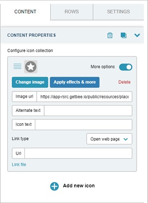
You can configure the icon row by:
-
Clicking add new icon in the content properties.
-
Selecting an image, e.g. a brand logo.
-
Selecting a link type, e.g. open a web page.
-
Add details for the link type, e.g. add a URL for the link.
-
Clicking add new icon to add a second, third, etc. icon, e.g. if your company has three brands or services, you could add an icon for each with the individual brand logo and a link to that brand's homepage.
Menu
The menu content block allows you to add text based hyperlinks to your creative, e.g. links to different product pages of your website. These work similar to the icons content but using text instead of images. Menus can be displayed horizontally or vertically.
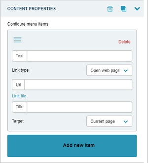
You can configure the menu content by:
-
Clicking add new item in the content properties.
-
Typing the text that will display in the creative into the text box.
-
Selecting a link type, e.g. send email.
-
Add details for the link type, e.g. email address to send to, subject, and body text.
-
Clicking add new item to add a second, third, etc. menu entry.
Rows and columns
By default, the blank creative provides a one-column environment. To add alternative column layouts row-by-row, select the ‘Row’ tab in the content panel.
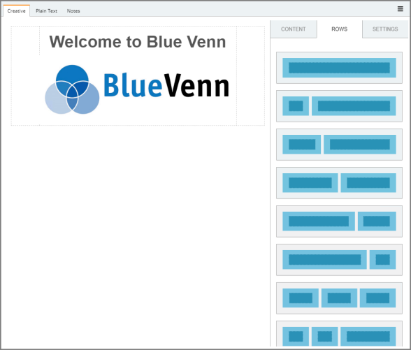
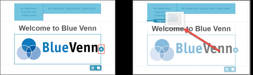
You can add a row to the next section of your creative, and it will be displayed using the same layout illustrated in the graphical representation thumbnail. To add, simply drag and drop the layout of choice. In the example below, a version of the two column layout is being added to the panel (above the existing text and image).
To add existing content into the new formatting, click within the content you wish to move, select the move icon and drag the content to the new area.
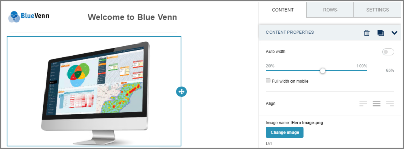
Repeat the process to add more content, or enter your content directly into a section. In the image below a single column row has been added, and another image has been included. You can adjust the width of the image using the side panel.
When you add a text box, you have the same editing functions available to help you alter the content, like changing the colour, size and alignment of the copy.
You can duplicate any existing content by clicking the duplicate button – this creates an exact replica displayed below the original section. Alter the new copy by adding different text and images.
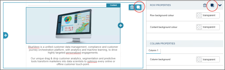
To alter the look of an entire region, select the structure, as opposed to each individual content type (image, text, etc.). You can define the row and content background colors as well as padding, border size, and color.